24/11/2009

Self- Evaluation 0UGD201

I have taken up the majority of time on this project by researching. Perhaps to much, as I didn't leave sufficient time to develop my own ideas and design production at the end. I feel my research has been very thorougher, covering relevant printing processes and other designers work for inspiration. A questionnaire provided me with the first part of primary research which lead to deciding which direction to take the project in. The questionnaire also instantly provided me with the first set of visuals as i asked everyone who participated to draw their pet.
Plenty of secondary research has also been gathered however some of it did not contribute to the development of final resolution. Secondary research provided me with a lot of understanding of print processes however i should have done more practical work to put what i have learnt into practise. I would like to have used the digital printing room however as i didn't not organise my time efficiently I only went to two drop in sessions. The notes written form the type, illustrator and photoshop lectures were very helpful to me when i came to produce the 16 page booklet. 
I am finding with each new project my software skills are developing. This is creating new possibilities and directions for me to take my work. Although i feel i have learnt a lot about print through the projects this term, i should have produced more practical work and there for improve the quality of the final pieces. I have come up with and developed a lot of ideas over the last project however left it too long to narrow down and focus on one. Hence this is probably the reason I did not produce much practical work. 
I found at the start of the project i was very organised and filled out actions plans, stuck to time tables ect however this useful habit faded out. In the last week i was stressed and needed to catch up so relayed on a brand new action plan and timetable to complete the work on time. The presentation of work is better then what it used to, but still needs work. For example taking more time to mount presentation boards so they are straight. 
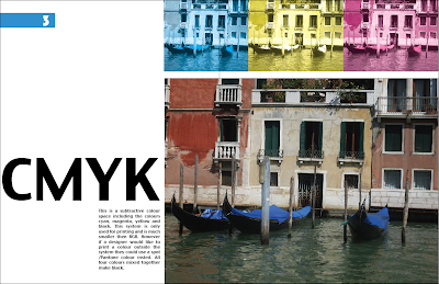
I thought the 16 page print booklet would be a good oppitunity to include some of the photos captured from over the summer. Although I am happy with it I spent to much time experimenting with colour systems. Therefore not including meny of the other possibilites with print in the booklet. However i did do a lot of research which has been posted onto blog.
The resolution produced form the 'Good 2' project. Fits the brief, however i feel i could have been more imaginative with it and produced something more interesting. Also it would have been nice to have made a completed package aswell as the demonstrating nets.

5 things i would do differently next time.
comment more on blog reflecting on what is working and what is not and what I am going to do about it.
produce more practical work and experiment more with different processes.
be more imaginative with ideas for final out comes
spend more time in studio drawing/writing.
take down more notes in lectures so not to forget crucial processes etc.
Stick to action plans and time tables.


20/11/2009

Finally finished the 16 page print-based publication!

It's finished but i am still going to make a few changes also i have another double page spread left to complete.
INKY LITTLE FINGERS is the name of the company who quoted the booklet
all i had to do was type in the details and they gave a quote online.
details about the booklet for print...
size A4- Portrait
Cover - Full colour all sides, Laminated with GLOSS, Paper 300gsm gloss
Inner pages- Full colour through out, 115gsm gloss
pages -20 pp
Quantity 1000
with in the next 4 days
PDF proofing

Quantity
Price
1000
£1,646.25
THIS PRICE IS FOR:-
20-page A4 Portrait booklets.
Digitally printed.
Cover printed full colour all sides on 300gsm gloss art card with a gloss laminate to one side.
Inner pages printed full colour throughout on 115gsm gloss art paper.
PDF proof.
Despatched 4 working days after you approve your proof.
Free delivery to a standard UK Mainland address.
The paper is FSC approved.
Zero rated for VAT.


18/11/2009

New dog box development


New turtle packaging design

New logo

The crit

I went into the crit needing some decisive feedback. The group thought as a whole all the boxes weren't working as a set. Though the turtle box was working the best and i should keep that as a starting point. The logo was not working and i need to keep the typography the same through out. Also suggested was to keep all the boxes the same shape as the turtle one however change the colour scheme applicable to each specific pet. Also maybe have an interactive cut out of the specific pet.
i.e dog brown
cat black and white or grey
turtle green
hamster light brown
I mentioned i was struggling with finding a suitable strong plastic stock to print on so I will probably print an example on to card instead.

17/11/2009

Poster


I though it might be a good idea to advertise the 'dog walking box'. So i have been looking at my context blog for some inspiration and found this nike poster advert. The combination of type, layout and image work well to make the trainers thought of as active and the subtle red keeps attention on the advertised 'tick' logo. I have copied, and produced a dog advert for the dog walking box. (I'm still thinking of a better name for it.)

16/11/2009

Pictograms


It has been suggested that I draw some pictograms to demonstrate how a dog walking gets you active. I've had a go and the verdict is they look ridiculous and a bit creepy. so i'll be giving them a miss and wont be including them in the pack.


Some type ideas


Other pets


As my 'good' project is not just for dogs, I have designed some other packaging focusing on other different pets.
The idea for the top one came from the shape of the net, to me it looked a bit like a turtle so made it green added a couple of eyes and hexagon shell print.

Last type session :-(

Through Thursdays type session we learnt how to write words to be read how we say them. First i experimented with my name. The others are of a car alarm, then cars speeding past. I first found it difficult but towards the end i found it easier.


11/11/2009

Box net design


Dog size guide


I have decided to make the box more useful by including a manual/chart or diagram demonstrating different types of dogs and their agility. Also pictograms of how you get fit with a dog walking work out, with different levels of intensity(Red=intense Blue= relaxed) .

10/11/2009

another box idea

I think this image makes it more clear what the box is used for.

Pet Top Trumps idea

09/11/2009

Printing booklet


I've been trying to get back up to speed with the design for print manual. I have been applying related settings and adjustments to some of my own photographs to use in the manual. Here are some pages i have got done so far.

Imagery, illustrator experimentation


The Husky poster on my context blog has inspired me to experiment with running dog silhouettes. I don't know what I am going to do with these images yet, maybe nothing.


From the above images i have attempted to produced the 'get fit, dog box' idea. The box would contain items designed to encourage people to get out and exorcise with their dog. ie lead, collar, ball, stopwatch, dog walking time table, etc.
To produce the image I have been experimenting with texture and other effects in illustrator. The concept above needs more work. I think the over all look appears to masculine so I'll develop a new colour scheme.


05/11/2009

Feedback from Crit 'what is good (part 2)'

In the critique yesterday i presented most of the work i had done so far, to the group. Everyone thought i had a good, broad range of research they particularly liked the drawings in the questionnaire. They thought I had a good understanding of the problem analysis and evaluations of key issues relating to the brief.
comments...
  • 'have fun with it?'
  • 'open it up, explore, initial response'
  • 'are you looking at dog?' target audience is important, what products would they use.'
  • "very good visual quality... I like the drawings"
  • 'instead of playing cards, perhaps use top trumps, contain pet facts'
  • "do more research into how a pet can make you more social and develop something from there."
  • "I like the cat planner"
  • "you've done a broad range of research, questionnaire was a good idea."
I don't think i was clear enough in the crit because i thought i mentioned who the target audience was, maybe the group meant I should focus on only dog owners.
I think the problem is, I'm not lacking ideas just what is the product to package and does this fit my concept?
I feel like I'm back at stage 1
however I have had  a lot of helpful feedback! I will read and try to address all the comments made. Also try and include and develop all the positives that have been pointed out in my work. 

Next step ACTION PLAN!

03/11/2009

Improve your health and life style, get a pet


The image is quite long so click for better look

Final Concept 'What is GOOD'


1 - A clear concept statement, including how you are saying it and to whom.
I have come up with a few concept ideas developed from 'what is Good part 1' including...
  • Encourage people to be active with their pets
  • It is good to learn about pets before owning one. (aimed at children as well as adults)
  • A house is not a home without a pet.
  • Adopt a dog campaign
I have decided to stick to this one...
'To improve your health and lifestyle, get a pet!'

This is aimed at lots of different people who don't have a pet but would benefit from owning one.
  • Over weight people
  • lonely people who are old and can't get out the house much
  • hectic people with no routine in their lives
  • people in need of a Guard dog
  • people who want to be seen with a pet. i.e Paris Hilton, etc
  • people who want a pet but have little time to look after it.
The project is to inform and will help pair up the right pet with the right sort of person.

2 - Discuss the broad and radical research you have done.
(design context blog)
I put together a questionnaire once filled in and handed back. I found that all participants owned a pet or had an idea of one they would like to own. Everyone had positives and negatives to say about their pets. The questionnaire also provided the first set of visuals.
I have researched into how other designers use pets in their work and why. This included children's book illustrators and writers i.e Beatrix Potter. I think pets and animals have expressive faces and big eyes therefore easy for a child to read. Also making animals and pets appear animated which allows the storeys to be more fictitious.
I have found plenty of pet facts and figures. Including proven health benifits from owning a pet.
  • Can improve your mood
  • Control blood pressure better then drugs
  • encourage you to get out and exercise
  • etc
I have also been looking at many example of products aimed at pets and packaging that uses pet imagery.

3 - Show the many and varied ideas development sheets that explore your concept and the possible contexts in which it might be effective.

These are hand done and i will bring them into the crit on wednesday.

4 - Clear evaluation of what's working or not and what you're going to do about it!
I have decided to continue with idea 1. A pack/kit that would encourage people to use their dog as a way for regular exercise and a way to keep fit. I have stared to design the packaging, combinding the look of sports wear and active pets. The target audience, people who already have dogs or don't but would like to change their unhealthy lifestyle by owning one.
So far my pack looks a bit like a shoe box for trainers. I will ask in the crit if they think that form of packaging is working or it should be a bag, tub or just a leaflet with no products.

6 - A focused action plan and realistic schedule of works
that will bring the project to a successful conclusion

I will do one after i have heard the feed back in crit session.